The brief
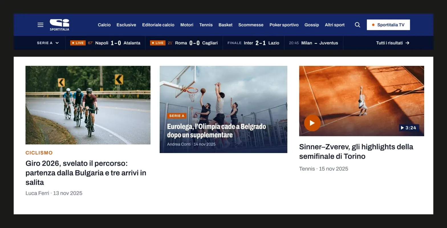
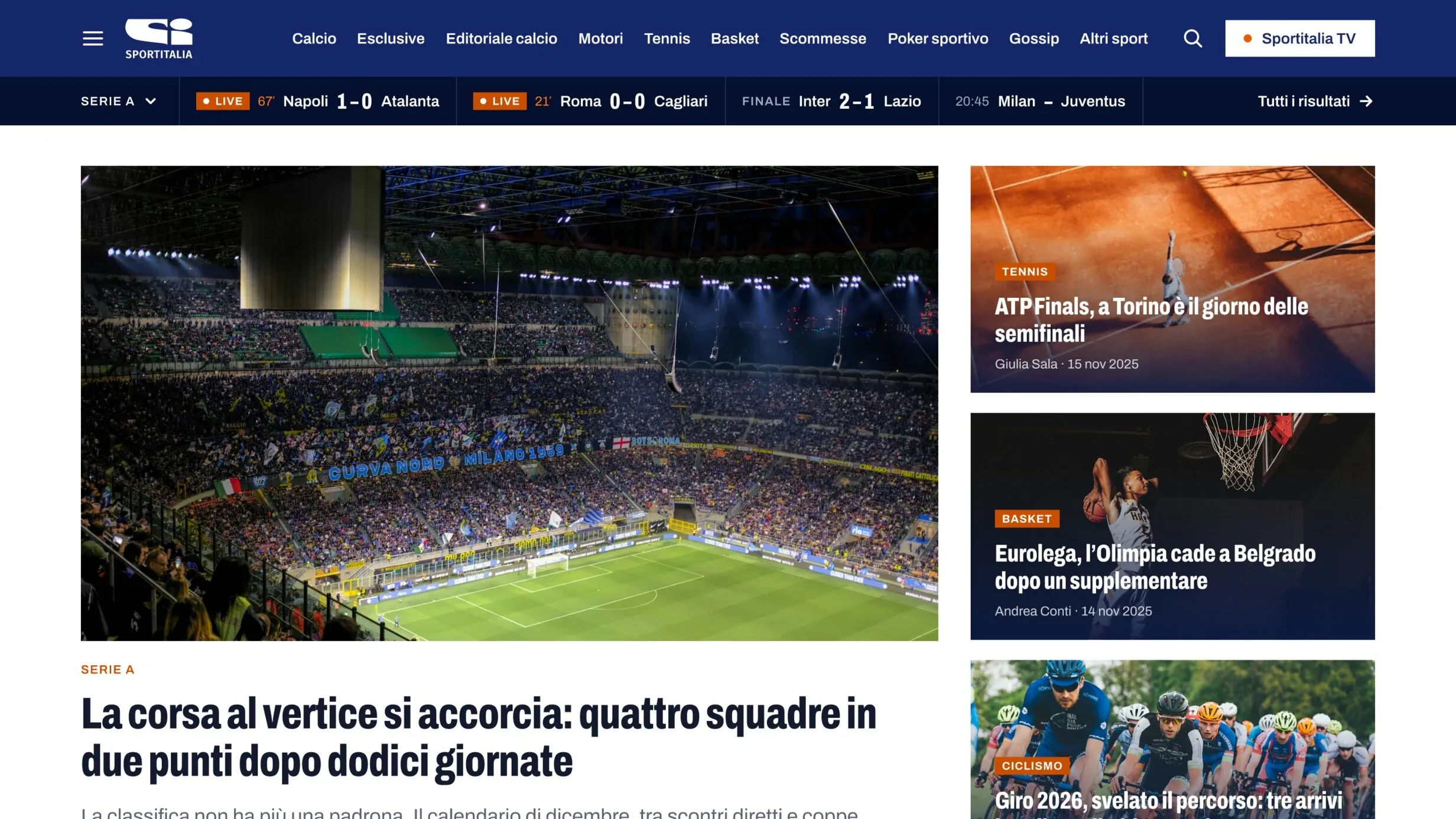
Sportitalia is an Italian sports TV network with a news site. The brief was a UI restyling of the site, so that it looks like the same brand as the channels. It was presented to Sportitalia in 2025 as a proposal.
Decisions
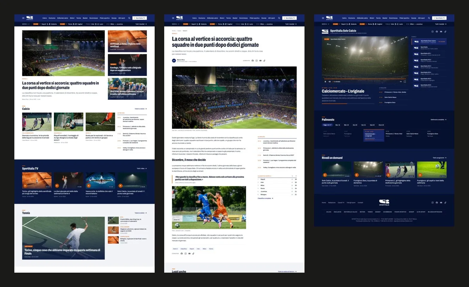
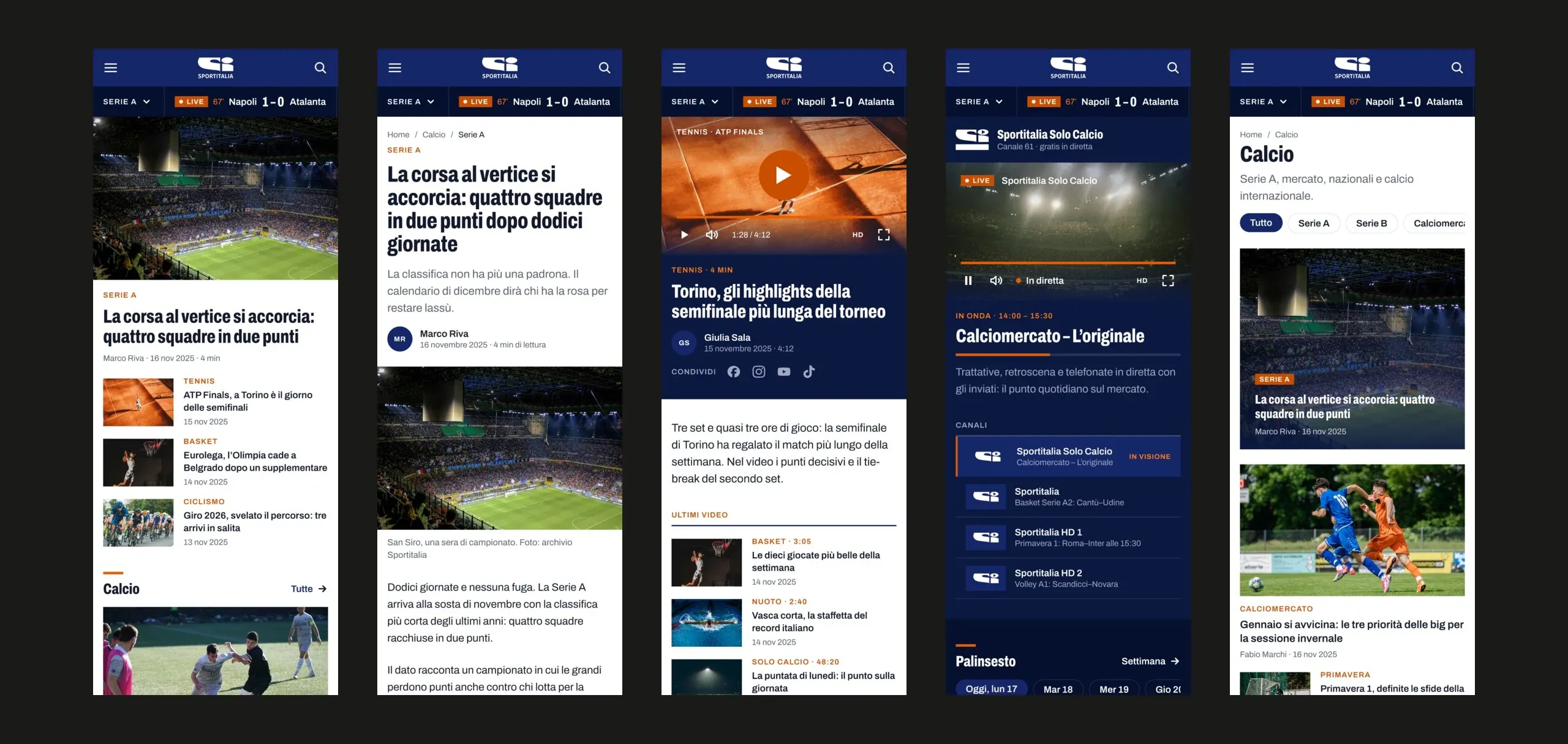
A front page changes all day, so every choice had to hold with any headline, any photo and any length. Five templates, home, article, video, streaming and category, each designed at 1440 and at 390 pixels.
Typography
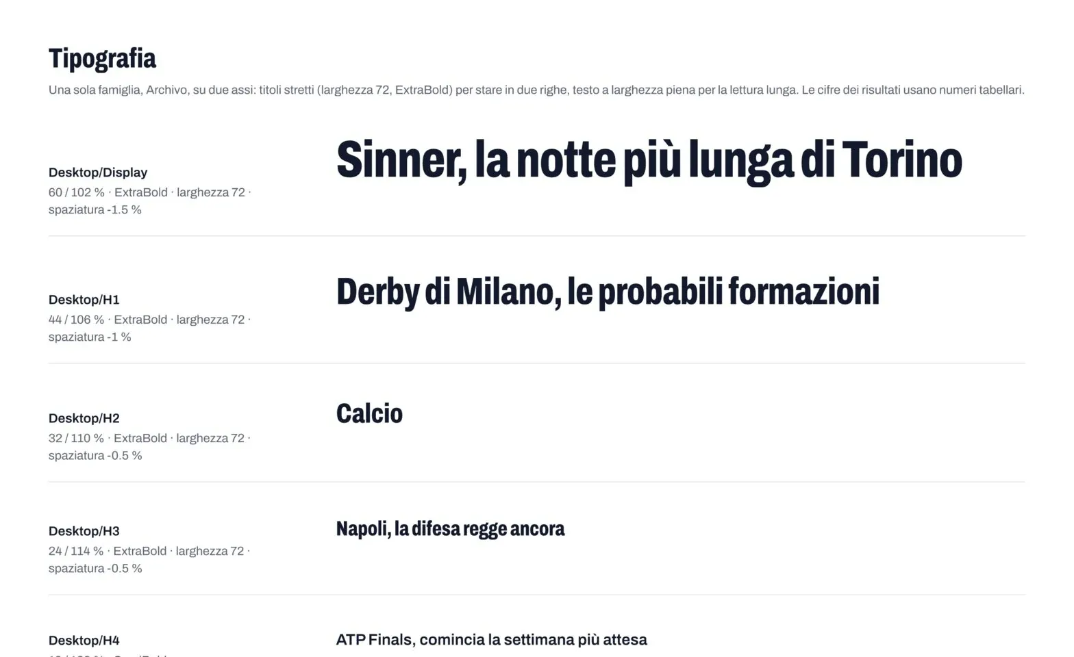
Archivo is a variable font: headlines run condensed, body text at full width. Long titles fit in two lines and articles stay easy to read.
Brand colour and contrast
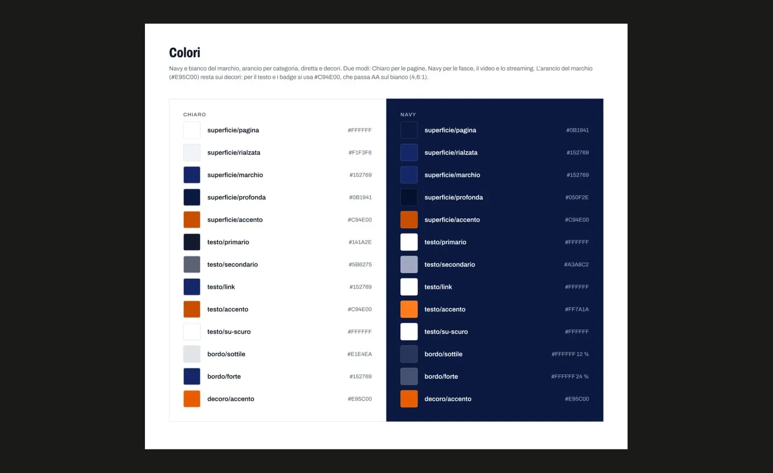
Navy and white come from the logo; orange marks categories, live matches and section rules. The brand orange reaches 3.5:1 on white, so small text and badges use a darker step at 4.6:1.
Light and navy modes
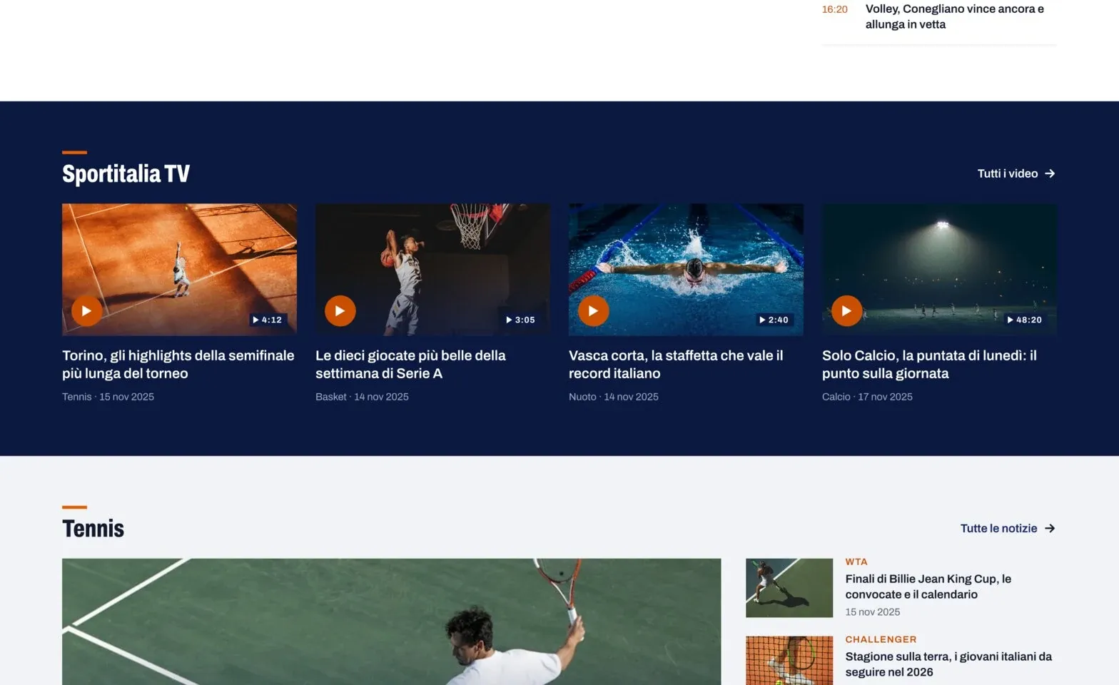
Every colour is a token with a light and a navy mode. The same cards and section titles work on white pages and on the navy bands for video and streaming.
Results bar
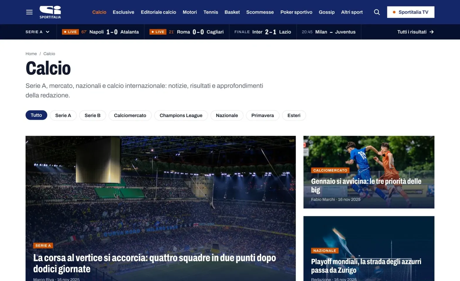
A results bar on every page shows live matches, final scores and kick-off times. Scores use tabular figures, so they line up from one match to the next.
Streaming schedule
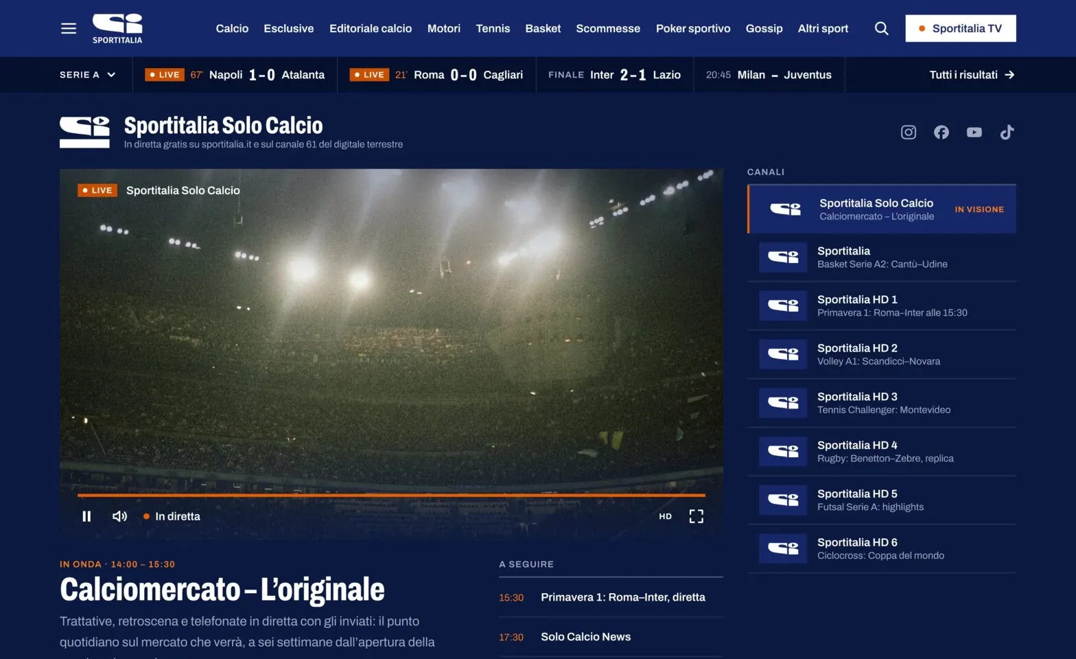
Next to the live player, the page shows what is on now, what comes next and what the other channels are airing. The day’s schedule sits below, with the current slot highlighted.
Mobile
Each template has a 390 px version. Rows of videos, date filters and the schedule scroll sideways instead of stacking.
Design system
54 tokens in two modes, 22 text styles and 56 components live in one file. A new section starts from parts that already exist.
/* tokens.css */
:root {
  --surface-page: #FFFFFF;
  --text-accent: #C94E00;
  --decor-accent: #E95C00;
}
[data-surface="navy"] {
  --surface-page: #0B1941;
  --text-accent: #FF7A1A;
}